Похожее видео
×
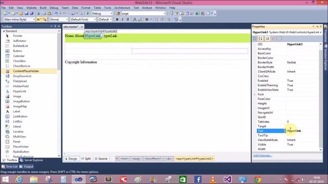
Image Hover Caption Text Effect HTML5 CSS3 Bootstrap4
Видео: Image Hover Caption Text Effect HTML5 CSS3 Bootstrap4
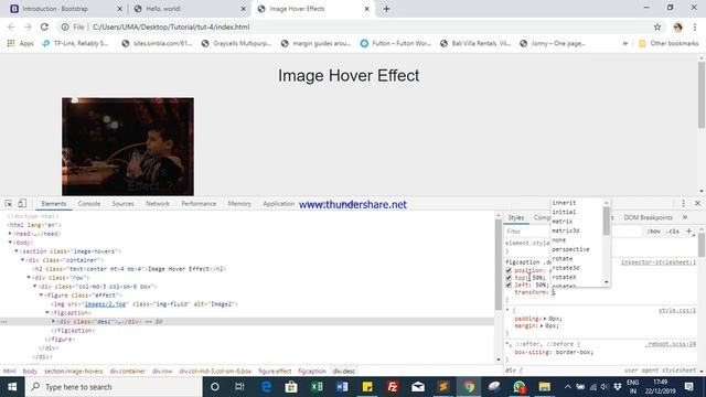
Hello friends This video is all about Image hover effect using Html5 new added elements : figure and figcaption this is just another way to add a caption to an image semantically through HTML. Below you guys can find the style.css file code. And If you feel like this tutorial is worth watching please do Subscribe and give a thumbsup. Note: Images which are used in this video are not mine. Thank you : CSS- style.css padding: 0px margin: 0px body font-family: sans-serif font-size: 17px background:eee section width: 100 .box position: relative figure position: relative overflow: hidden cursor: pointer figure.effect img transition: all .3s figure.effect:hover img transition: all .3s ease-in-out transform: scale1.3 figcaption position: absolute left: 10px top: 10px bottom: 10px right: 10px background: rgba000.6 opacity: 0 border: 1px solid fff figcaption .desc padding: 12px width: 100 position: absolute top: 50 left: 50 transform: translate-50-50 text-align: center figure.effect:hover figcaption opacity: 1 transition: all .4s ease-in-out figcaption .desc h4 color: fff font-size: 20px figcaption .desc p color: fff font-size: 15px padding: 0px margin: 0px body font-family: sans-serif font-size: 17px background:eee section width: 100 .box position: relative figure position: relative overflow: hidden cursor: pointer figure.effect img transition: all .3s figure.effect:hover img transition: all .3s ease-in-out transform: scale1.3 figcaption position: absolute left: 10px top: 10px bottom: 10px right: 10px background: rgba000.6 opacity: 0 border: 1px solid fff figcaption .desc padding: 12px width: 100 position: absolute top: 50 left: 50 transform: translate-50-50 text-align: center figure.effect:hover figcaption opacity: 1 transition: all .4s ease-in-out figcaption .desc h4 color: fff font-size: 20px figcaption .desc p color: fff font-size: 15px ,


2023-12-03 в 05:35:55


2023-12-03 в 05:27:17

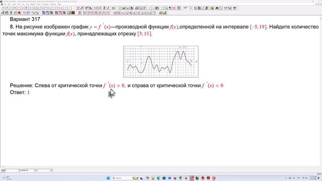
2026-04-20 в 15:05:13

2026-04-20 в 15:04:13

2026-04-20 в 15:09:46

2026-04-20 в 15:07:16